


















































Support and Resistance Market Analysis: A Trader’s Framework

Table of Contents
- Introduction
- What Is Support and Resistance?
- Why Support and Resistance Matters for Traders and Investors
- Core Concepts
- Step-by-Step Guide
- Practical Tips for Better Results
- Common Mistakes to Avoid
- Frequently Asked Questions
- Conclusion
Introduction
The S&P 500 has spent the past several months chopping through the same price band, with every rally meeting sellers near a ceiling and every dip finding buyers at a floor. Bitcoin trades in recognizable ranges. Crude oil oscillates between well-marked zones. Whether you follow equities, forex, or commodities, the same question surfaces on every chart: where will price reverse, and where might it break?
That question is the entire reason support resistance market analysis exists. Levels where supply has historically overwhelmed demand, and levels where demand has absorbed supply, anchor almost every trading decision made on a price chart. Hedge funds lean on them. Day traders draw them on five-minute charts. Long-term investors use them to size entries around earnings prints. Sell-side technical analysts publish them in client notes before every Federal Reserve meeting.
This article gives you a working framework, the kind a floor trader or institutional technical analyst would actually rely on. You will learn how real support and resistance form, how to draw them on your own charts, and how to combine them with volume, timeframes, and risk rules. The goal is not memorization of rules. The goal is a repeatable method you can apply to the S&P 500, the Nasdaq, EUR/USD, or any liquid instrument you follow.
What Is Support and Resistance?
Support and resistance are price levels where the balance between buyers and sellers tends to shift. Support is a zone where demand has historically been strong enough to halt declines. Resistance is a zone where supply has historically been strong enough to stall advances. They are not lines drawn by an algorithm. They are behavioral footprints left in the price record.
Think about what happens when a stock pulls back to a level where it previously bottomed. Many of the same participants who bought the first time are still watching that same price. Some will add to winning positions. Others who missed the first move see a second chance and step in. The clustering of buy orders creates demand, and the price stabilizes. That is a support level in plain English.
Resistance works the same way in reverse. When a stock approaches a prior peak, investors who missed the exit remember the disappointment. Short sellers see an opportunity. Profit-taking accelerates. The result is a ceiling, often within a few cents of the original high, where resting supply overwhelms new demand.
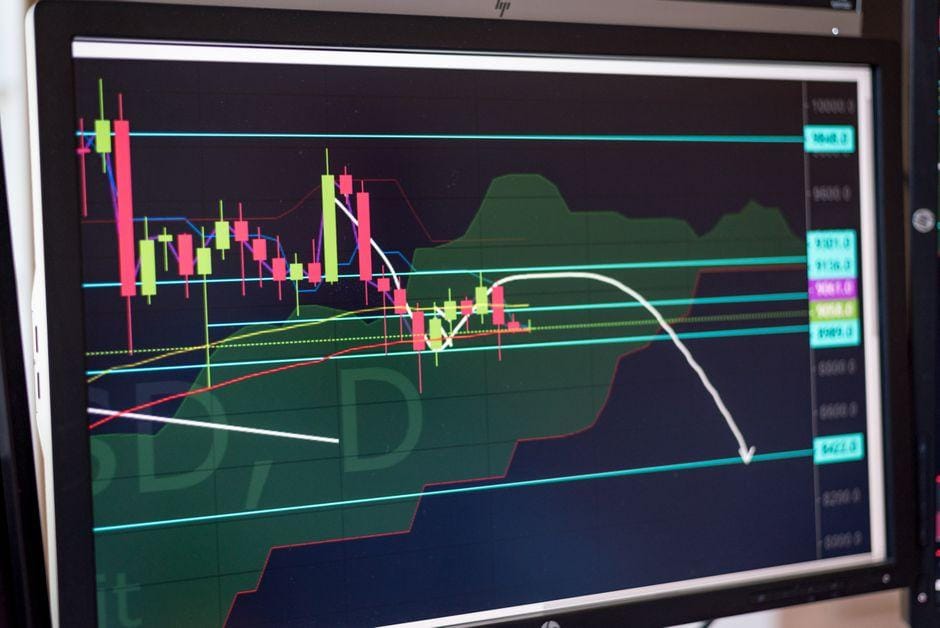
The strongest support resistance levels are not single prices but zones. Buyers and sellers act over a range, not at one tick. A level that held three times carries more weight than one that held once. A level that aligns with a round number, a prior gap on the chart, or a widely watched moving average carries more weight than a random pivot. These confluences are what turn a simple horizontal line into a high-probability trade location.
Why Support and Resistance Matters for Traders and Investors
Ignore support and resistance and you are trading in the dark. You have no framework for where to enter, where to cut a loss, or where a trend might exhaust. You will buy tops and sell bottoms simply because you have no reference points on the chart.
For short-term traders, these levels dictate where breakouts occur, where failed breakouts trap the crowd, and where volatility tends to compress before expanding. A tight range near a well-watched resistance level on the S&P 500 often sets up the next directional move, especially around Federal Reserve announcements or CPI releases. The breakout itself is rarely the cleanest trade. The retest of the breakout level is where the better risk-reward lives.
For longer-term investors, support and resistance help with position sizing and rebalancing. If a stock has consolidated for months between 80 and 100, a breakdown below 80 is a signal to reduce exposure rather than average down. If it clears 100 on heavy volume with expanding breadth, that represents a structural change worth respecting.
The mechanism also connects directly to risk management. A support level is a natural place for a stop-loss. A resistance level is a natural place to take profits. Without these anchors, traders fall back on gut feel, and gut feel is what produces the 30 percent annual drawdowns that end most retail accounts. Position sizing anchored to a clear level keeps risk quantifiable and consistent.
Concept 1: How Support and Resistance Form From Market Memory
Every level you see on a chart exists because market participants remember it. That memory is what turns a random old price into a self-fulfilling zone.
Consider a stock that traded at 50 for weeks, broke out to 70, then reversed hard. The investors who bought at 50 and sold near 70 have positive memories of that level. The investors who chased at 70 and rode it back down have scars. When price returns to 50 months later, both groups are paying attention. The first group is willing to add. The second group is ready to exit break-even. New buyers see a clear reference point. The result is buying interest that did not exist at 49 or 51.
This is why support and resistance work across the Nasdaq, in forex, in Treasury yields, and in Bitcoin. Liquidity concentrates at remembered prices. The chart is just a record of where the crowd agreed to transact, and where they agreed to walk away. The same psychology that anchors a 50 price on a small-cap stock also anchors 5000 on the S&P 500 or 100,000 on Bitcoin.
Concept 2: The Role of Volume in Validating Levels
A level is only as strong as the volume that tested it. A support level that held on one quiet session can shatter when a single news event delivers volume. A resistance level that has been tested five times with rising volume each time carries far more weight than one that has only been touched once.
The classic rule: volume expands on the test of a major level and contracts on the move away. A breakout above resistance on heavy volume is more likely to hold. A breakout on light volume often fails, producing a bull trap that punishes anyone who chased the move. The same logic applies in reverse at support. Capitulation volume on a breakdown tends to mark the end of a decline, while quiet breakdowns often reverse.
The VIX index offers a real-time check. Rising VIX during a test of support is a warning that the level is being defended with conviction from the sell side, and that buyers may be running out of patience. Falling VIX during a test of resistance can signal that supply is drying up, setting up the next leg higher. Volume does not predict direction, but it tells you which level actually matters and which one is decorative.
Concept 3: Timeframe Confluence and the Hierarchy of Levels
Not all support and resistance are equal. A level visible on a daily chart carries more weight than one visible only on a five-minute chart. A level that appears on both the weekly and the hourly chart is far more important than one that appears on only one.
This is the concept of timeframe confluence. A horizontal level that aligns with a prior swing high on the weekly chart, a round number like 5000 on the S&P 500, and the 200-day moving average is a high-conviction zone. A trader already in a position will defend that level aggressively. A trader looking for an entry will wait for confirmation at that exact price before committing capital.
In practice, the most powerful levels are those that stack. A horizontal support that also coincides with prior volume concentration, a moving average, and a Fibonacci retracement becomes a magnet. Price often returns to these stacked zones precisely because so many participants are watching the same chart, drawing the same lines, and placing orders at the same prices. The result is self-fulfilling liquidity.
Step 1 — Identify Swing Highs and Swing Lows on Your Primary Chart
Start with the timeframe that matches your holding period. A swing trader uses the daily or four-hour chart. A day trader uses the 15-minute or five-minute. A position investor uses the weekly.
Mark every clear swing high (a peak where price reversed at least twice) and every clear swing low (a trough where price reversed at least twice). Do not draw lines yet. Just list the levels. The more times a level was tested, the more important it is. A swing high tested three times in six months carries more weight than one touched once and forgotten.
Ignore minor wiggles. Only mark levels where price made a clear decision, where the candle bodies and wicks show a real rejection rather than a one-tick blip in heavy liquidity. If a level cannot be spotted at a glance, it probably will not attract meaningful institutional interest when the market returns to it.
Step 2 — Draw Zones, Not Lines
Once your levels are marked, draw them as horizontal zones rather than single lines. A support zone might span 1 to 2 percent of the price, especially on a daily chart. Resistance works the same way. Lines look precise on screen but pretend the market trades to the tick. It does not. Demand and supply act across ranges, and stops cluster in pockets just beyond obvious levels.
Adjust the zone width as you review. If the level keeps holding just above a specific price, the zone starts there. If the prior reaction was a wick that pierced lower, extend the zone to include the wick. The market does not care about neat drawings. It cares about where orders cluster, and that is rarely a single price.
Volume profile can help refine these zones. The Point of Control, the price with the most traded volume in a given range, often sits at the heart of a major support or resistance zone. Combine horizontal levels with volume profile and the zones become far more precise.
Step 3 — Plan the Trade Around the Level, Not the Breakout
Most beginners make the mistake of chasing breakouts. A disciplined approach does the opposite. You plan three scenarios in advance:
1. Bounce: price approaches the level and reverses. Entry on confirmation, stop just beyond the level.
2. Break and retest: price pierces the level on volume, then returns to test it from the other side. Entry on the retest, stop inside the failed level.
3. Failure: price chops through the level without follow-through. Stay out. This is the scenario most retail traders get wrong, because they assume every breakout is real and every breakdown is a buying opportunity.
Match your position size to the distance between entry and stop. A level that gives you a 3 percent stop before the next resistance offers a different risk-reward than a level that gives you 0.5 percent. Position sizing is what turns the same chart reading into a profitable trade or a losing one. A 1 percent risk on a 5 percent target is a fundamentally different bet than 1 percent risk on a 0.5 percent target, even if the chart looks identical.
Practical Tips for Better Results
- Combine horizontal support resistance with a moving average, such as the 50-day or 200-day. When price approaches both on the same day, the level becomes far more reliable because two independent indicator groups are watching the same area.
- Use round numbers as a final filter. Levels ending in 0 or 5 (think 100, 5000, 1.2500 in EUR/USD) attract more orders than arbitrary prices because retail attention concentrates there, and many institutional algorithms are also coded to respect them.
- Watch the first retest of a broken level more than the breakout itself. The breakout is often driven by stops. The retest shows whether the new support or resistance will hold and whether the smart money is accumulating or distributing.
- Compare across correlated markets. If the S&P 500 is testing resistance while the Nasdaq is already weakening, the level is more likely to fail. Divergence between correlated indices is a useful early warning, and it shows up often around major macro events.
- Track the location of your stop relative to the day’s high or low range. A stop just under a clear level, sized at less than 1 percent of account equity, survives most noise. A wider stop invites deeper drawdowns and erodes the math of any single trade.
- Reduce size into major data releases. Nonfarm payrolls, CPI, and Federal Reserve decisions routinely punch through well-watched levels. Smaller size keeps you in the game when the level fails and the market gaps through your stop.
- Reassess weekly. Levels that mattered three months ago often stop mattering. A market in a new regime, defined by new highs, new lows, and shifting correlations, leaves old support resistance behind. Update the chart the way a pilot updates a flight plan.
- Keep a trading log. Note which levels held, which broke, and what the volume looked like at the test. After fifty trades, the patterns in your own behavior become as instructive as the patterns in price.
Common Mistakes to Avoid
- Drawing too many lines. A cluttered chart paralyzes decision-making. Three to five high-conviction levels are more useful than fifteen minor ones, and they force you to prioritize.
- Treating a level as exact. Buyers and sellers act across a zone. A stop placed one tick below support will get hit by noise. Build in a buffer of at least 0.2 to 0.5 percent on liquid instruments.
- Ignoring higher timeframes. A level on the five-minute chart is irrelevant if price is sitting on major weekly resistance. Always check the higher timeframe before committing capital.
- Assuming a breakout is real on first touch. A real breakout needs volume, follow-through, and ideally a successful retest. Without those, the move often reverses and leaves late buyers trapped.
- Averaging down into a broken level. If support has failed with a clean candle close below, adding to losers is a recipe for capital destruction. The structure has changed, and so should your positioning.
- Skipping risk management. Support and resistance guide entries and exits, but they do not size positions. Without a fixed risk per trade, even the best levels will not save the account.
- Recency bias. Just because a level held last week does not mean it will hold this week, particularly after a regime shift in volatility or a change in Federal Reserve policy.
What is the best timeframe for support and resistance analysis?
There is no single best timeframe. The right choice depends on your holding period. Day traders focus on the 5-minute, 15-minute, and 1-hour charts. Swing traders use the 4-hour and daily. Position investors rely on the weekly and monthly. The most useful approach is to mark levels on the higher timeframe first, then drill down to your execution timeframe to refine entries. A level visible on both the weekly and the 1-hour chart is far more powerful than one visible on only the lower timeframe.
How do you tell the difference between a real breakout and a fake one?
A real breakout usually shows three traits: above-average volume on the break, follow-through in the same direction over the next one to three sessions, and ideally a successful retest of the broken level from the other side. A fake breakout, sometimes called a bull or bear trap, often happens on light volume, lacks follow-through, and reverses back through the level within a day or two. The VIX and correlated assets can also confirm or warn. A breakout that occurs while volatility is compressing tends to be more reliable than one that happens during a panic, when forced flows can distort price action.
Can support and resistance work in forex and crypto, or only stocks?
They work in any market with enough liquidity and price history, which includes major forex pairs such as EUR/USD and USD/JPY, large-cap crypto like Bitcoin and Ethereum, commodities such as gold and crude oil, and Treasury futures. The mechanism is the same. Market memory, clustering of orders, and behavioral anchoring apply across asset classes and across exchanges. The only markets where support resistance analysis fails consistently are those with very low liquidity or thin trading, where a single participant can move price and where the chart is not an honest record of distributed opinion.
How do you combine support and resistance with indicators like RSI or MACD?
Indicators confirm or warn. RSI below 30 at a support level is a stronger buy signal than RSI at 50, because the oscillator is already signaling exhaustion. MACD bullish divergence at a support level increases the odds of a bounce. Conversely, RSI above 70 at resistance often signals exhaustion and a higher probability of reversal. Use indicators to filter, not to replace, the price-based reading. A level that aligns with an indicator signal is higher conviction. A level that contradicts an indicator signal deserves smaller size or no trade at all.
Are round numbers really important for support and resistance?
Yes, but the effect is psychological and most pronounced in markets with heavy retail participation. Round numbers like 5000 on the S&P 500, 100 on a stock, or 1.1000 on EUR/USD concentrate orders. They are not magical, but they are real liquidity zones where option strikes cluster, where index rebalances occur, and where the headlines in financial media tend to focus. The best setups combine a round number with a horizontal level from a prior swing and a moving average. The more reasons participants have to act at a price, the more likely the level holds.
What is the biggest risk of relying on support and resistance?
The biggest risk is treating levels as if they cannot fail. Every support level eventually breaks. Every resistance eventually breaks. The trader’s job is to plan for both outcomes, size accordingly, and avoid the common trap of assuming a level will hold simply because it has held before. Levels are probabilities, not guarantees. The market does not owe you a bounce, and a single position sized for certainty rather than probability can produce a drawdown large enough to end a trading career.
Conclusion
Support and resistance market analysis works because markets are made of people, and people remember prices. That memory creates the clustering of orders, the reactions at old highs and lows, and the orderly structure that makes charts readable. The framework is not a magic line. It is a behavioral map of where the crowd has agreed to act, and where it is likely to act again.
The single most important lesson: draw fewer levels, draw them as zones, and let volume, timeframes, and risk management tell you which ones actually matter. Start with the higher timeframe. Add one moving average. Watch how price behaves at the zone rather than predicting what it will do. Then size the trade so that even a failed level cannot take you out of the game.
A practical next step: open your most-watched chart right now, switch to the weekly, and mark the three most obvious horizontal zones from the past year. Switch to the daily, refine them, then check what the volume profile says. You will see the same levels appear across all three views, and you will start to understand why professional desks have used this framework for decades.
Trading involves real risk of loss. Past price behavior does not guarantee future results. Manage position size, honor stops, and never risk capital you cannot afford to lose.
—
This article is for educational purposes only and does not constitute investment advice. Trading and investing carry risk of loss; never invest more than you can afford to lose.
Last reviewed: August 2026