


















































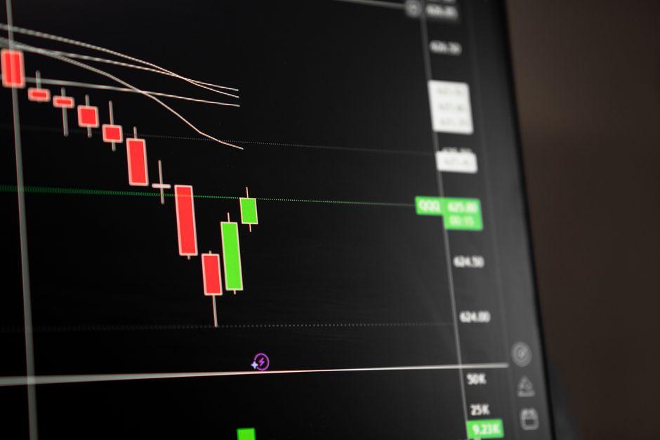
Best Technical Analysis Chart Patterns for High-Accuracy Entries

Table of Contents
- Introduction
- What Is Chart Pattern Analysis
- Why Chart Pattern Analysis Matters for Traders and Investors
- Core Concepts
- Step-by-Step Guide
- Practical Tips for Better Results
- Common Mistakes to Avoid
- Frequently Asked Questions
- Conclusion
Introduction
A stock breaks above resistance on the daily chart. Volume looks decent. The trader buys, expecting continuation. Within two sessions, price reverses through the breakout level, stops the position out, and resumes its prior trend. This scenario plays out across thousands of accounts every week. It is the central problem this article addresses.
The best technical analysis chart patterns are not about recognizing shapes. They are about confirming that the supply-and-demand imbalance behind the shape is real. A cup and handle, a bull flag, or an inverse head and shoulders means very little without volume confirmation, multi-timeframe alignment, and an understanding of the market regime in which the pattern forms. Traders who ignore these filters are essentially trading noise and hoping for structure.
This article breaks down how to filter chart patterns for high-accuracy entries by combining volume spread analysis with multi-timeframe alignment. You will see why certain patterns work, how to confirm them, and where they tend to fail. The focus is on practical mechanics — what to look for on the chart, what to check before entering, and how to manage the position once you are in it.
What Is Chart Pattern Analysis
Chart pattern analysis is the study of recurring price formations that reflect the psychology of buyers and sellers over a specific period. These patterns — consolidations, reversals, and continuation structures — emerge because market participants react to support and resistance levels in predictable ways. The patterns themselves do not predict the future. They describe the current balance of power between buyers and sellers and offer a framework for estimating where that balance may shift.
Consider a trader watching Nvidia (NVDA) after a strong uptrend. The stock pauses for three weeks, forming a rounded consolidation followed by a small downward drift on decreasing volume — a classic cup and handle. The trader does not buy simply because the shape looks right. They wait for price to break above the rim of the cup on a volume spike that is at least double the average. That volume confirmation tells them institutional buyers are participating, not just retail momentum chasers. The pattern provides the setup. The volume provides the confirmation.
The distinction matters. A shape on a chart is a hypothesis. Volume is the evidence. Without evidence, a hypothesis is just a guess — and guesses do not survive long in markets where participants are competing for edge at every tick.
Why Chart Pattern Analysis Matters for Traders and Investors
Chart patterns matter because they provide a structured framework for entries and exits in markets that are otherwise noisy and ambiguous. Without a pattern-based approach, traders rely on gut feel, news headlines, or random indicators that often contradict each other. A disciplined pattern framework forces you to wait for a specific setup, define your risk level, and enter only when conditions align.
For active traders in the S&P 500 or Nasdaq futures, pattern analysis helps identify where institutional order flow is likely to cluster. Support and resistance levels that form patterns are often the same levels where large participants place stop orders, creating liquidity events that drive breakouts or reversals. Understanding this dynamic allows a trader to position themselves on the side of institutional flow rather than against it.
For investors with longer horizons, pattern analysis offers a way to improve entry timing on positions they plan to hold for months or years. An investor who wants to own a quality stock at a better price can wait for a Wyckoff accumulation phase to complete, entering near the spring point rather than chasing an extended move. This reduces initial drawdown and improves the risk-reward ratio of the position from the start.
Ignoring pattern analysis does not make a trader or investor fail by default. But it removes a critical layer of structure. Without it, you are trading without a map, reacting to price moves after they happen rather than positioning ahead of them with defined risk.
Wyckoff Accumulation Spring and Volume Spread Analysis
The Wyckoff accumulation spring is a specific event within a broader accumulation phase where price briefly penetrates below a support level, traps late sellers, and then reverses sharply back above that level. The spring is significant because it represents a final shakeout of weak holders before a markup phase begins. Volume spread analysis — the study of the relationship between price range, volume, and closing position — helps confirm whether a spring is genuine.
Here is how the mechanism works. During accumulation, a stock or index trades sideways in a range. Smart money accumulates positions quietly, absorbing supply. Near the end of this phase, price drops below the range low on increased volume. This scares holders into selling. But the volume spread analysis tells a different story: the candle that breaks below support has a wide range but closes near its midpoint or upper portion, and the next candle reverses upward on even higher volume. This tells you that selling pressure was absorbed, not that new aggressive selling entered the market.
A practical scenario: imagine a stock in the Nasdaq that has traded between 80 and 90 for six months. Price suddenly drops to 77 on heavy volume, then closes the day at 84. The following session, price opens at 83 and closes at 88 on volume that is 50 percent higher than the breakout day’s volume. A trader using Wyckoff principles would recognize this as a spring — the break below support was met with buying, not continuation selling. The entry would be placed near 85, with a stop below 77, risking approximately 10 percent to capture a move back toward the range high at 90 and potentially higher into a markup phase. The volume spread analysis confirms that demand overwhelmed supply at the critical moment.
The spring works because it exploits a structural feature of markets: stop orders cluster below obvious support. When price pierces that level, stops trigger, creating a burst of sell orders. If a large buyer is waiting to absorb that supply, the candle closes well off its lows and the next session confirms the reversal. If no buyer is present, price stays below support and the downtrend continues. Volume spread analysis is how you tell the difference.
Volatility Contraction Pattern (VCP) in Bull Flags
The Volatility Contraction Pattern, popularized by Mark Minervini, is a consolidation structure where price volatility decreases progressively from left to right. Each successive contraction is narrower and tighter than the previous one, with volume drying up as the pattern nears its resolution point. The VCP often appears within a bull flag or a flat base after a strong directional move, and it reflects a market where supply is being exhausted.
The core idea is that volatility contracts because fewer sellers are willing to sell at current prices. As supply dries up, the price range tightens. When demand returns — even a modest amount — the reduced supply causes price to move quickly and decisively. This is why VCP breakouts tend to be sharp and clean when they work.
Consider a stock that has rallied from 50 to 70 over four weeks, then enters consolidation. The first contraction sees price swing between 68 and 72 — a 4-point range. The second contraction tightens to 69 to 71 — a 2-point range. The third contraction narrows further to 69.50 to 70.50, with daily volume dropping to the lowest levels since the rally began. A trader watching this formation would set an alert at 70.50, the top of the final contraction. When price breaks above 71 on volume that exceeds the 20-day average, the entry triggers. The stop goes below 69, the bottom of the last contraction, risking roughly 1.5 points to capture a move toward the measured target based on the prior rally’s range. The VCP’s power lies in its tight risk point — the stop is close, and the potential reward is multiples of the risk.
What makes the VCP different from a random tightening of price is the progression. Three or more contractions, each tighter than the last, each on lower volume, create a specific signature: supply is methodically being removed from the market. The breakout from the final contraction is the moment where the last sellers have exited and even modest demand can push price sharply higher. Traders who understand this dynamic are not surprised by the explosive move. They are waiting for it.
Inverse Head and Shoulders Neckline Breakout Mechanics
The inverse head and shoulders is a reversal pattern that forms after a downtrend. It consists of three troughs: a left shoulder, a lower head, and a right shoulder that is roughly equal to the left shoulder. The neckline is drawn across the highs between the shoulders. A breakout above this neckline signals that the prior downtrend has likely ended and a new uptrend is beginning.
The mechanics matter more than the shape. The right shoulder should form on lower volume than the left shoulder, indicating that selling pressure is waning. The breakout above the neckline should occur on higher volume, confirming that buyers are stepping in with conviction. Without this volume dynamic, the pattern is suspect.
A concrete example: a currency pair in the forex market, say EUR/USD, has been declining for months. It forms a low at 1.0500 (left shoulder), drops further to 1.0300 (head), then bounces to 1.0600 (neckline). Price declines again but only to 1.0450 (right shoulder) — a higher low than the head — on noticeably lower volume than the left shoulder’s decline. Price then rallies back to 1.0600 and breaks above on a session where volume is 40 percent higher than the prior five-day average. A trader would enter near 1.0610, place a stop below the right shoulder at 1.0440, and target the measured move — the distance from the head to the neckline projected upward from the breakout point, which would be approximately 1.0900. The key confirmation is the volume expansion on the breakout candle combined with the right shoulder’s lighter volume, which together signal that sellers are exhausted and buyers are taking control.
The inverse head and shoulders works because it maps a transfer of control. The left shoulder represents the last gasp of aggressive selling. The head is the capitulation low — the point where the most fearful sellers exit. The right shoulder, forming on lighter volume, shows that the selling has lost its force. The neckline break, on rising volume, confirms that buyers now dominate. Each phase has a volume signature, and reading those signatures is what separates a confirmed reversal from a pattern drawn in hindsight.
Step-by-Step Guide
Step 1 — Identify the Pattern on the Higher Timeframe
Start on the daily or weekly chart, depending on your trading horizon. Look for a pattern that has had time to develop — at least several weeks for a consolidation, longer for accumulation or distribution phases. A pattern that forms over only two or three days is statistically less reliable because it has not had enough time to reflect a meaningful shift in supply and demand. Mark the key levels: support, resistance, the neckline, the cup rim, or the contraction boundaries. These levels will define your entry, stop, and target.
The higher timeframe is where the structural signal lives. A daily chart shows the footprint of institutional positioning over weeks. A weekly chart shows it over months. Patterns visible on these timeframes carry more weight because they represent more capital committed at specific levels. A 5-minute pattern, by contrast, may reflect nothing more than a single algorithm’s intraday routine.
Step 2 — Confirm With Volume Spread Analysis and Multi-Timeframe Alignment
Before considering an entry, check volume behavior within the pattern. In continuation patterns like bull flags or VCPs, volume should decrease as the pattern tightens. In reversal patterns like inverse head and shoulders or Wyckoff springs, volume should diverge from price — lighter on the final decline, heavier on the reversal. Then drop to a lower timeframe — the 4-hour or 1-hour chart — and check whether the shorter timeframe supports the same direction. If the daily chart shows a bull flag breakout but the 1-hour chart is in a short-term downtrend, the entry is premature. Multi-timeframe alignment means the higher timeframe sets the direction and the lower timeframe provides the entry trigger.
This step is where most traders fail. They see the pattern on the daily, get excited, and enter without checking whether the lower timeframe agrees. The result is an entry that immediately faces a counter-trend move on the lower timeframe, forcing the position underwater before the higher-timeframe thesis has a chance to play out. Alignment does not guarantee success, but misalignment dramatically increases the probability of a stop-out.
Step 3 — Enter on the Breakout With a Defined Risk Plan
Place your entry order at the breakout level — above resistance for longs, below support for shorts. Use a stop-loss order immediately, placed at a level that invalidates the pattern if hit. For a bull flag, the stop goes below the flag’s low. For an inverse head and shoulders, the stop goes below the right shoulder. Define your position size based on the distance to the stop, not on a fixed share count. If your maximum risk per trade is 1 percent of your account and the stop distance is 2 percent of the entry price, your position size is calculated accordingly. This ensures that every pattern trade carries the same dollar risk even if the instrument’s volatility differs.
Position sizing is the mathematical backbone of pattern trading. Two traders can identify the same pattern, enter at the same price, and exit at the same target — but if one risks 1 percent and the other risks 5 percent, their outcomes over a hundred trades will look completely different. The pattern is the setup. The risk plan is what keeps you in the game long enough for the pattern’s edge to manifest.
Practical Tips for Better Results
- Check the VIX or the relevant volatility index for your market before entering pattern breakouts. High implied volatility environments produce more false breakouts because price swings are wider and stops are more likely to be triggered. In low-volatility regimes, breakouts from tight contractions tend to be cleaner.
- Wait for the breakout candle to close before entering. Many false breakouts occur intraday when price spikes above resistance, triggers buy stops, and then reverses by the close. A daily close above the breakout level is a stronger signal than an intraday penetration.
- Use the 50-day and 200-day moving averages as directional filters. Patterns that form above both averages have a higher probability of resolving in the direction of the pattern because the broader trend supports the setup. Patterns that form below both averages are fighting the trend and carry lower win rates.
- Measure the distance from the entry to the stop and compare it to the distance from the entry to the target. If the risk-reward ratio is below 2:1, the trade does not justify the risk. Waiting for a tighter entry point within the pattern can improve this ratio without changing the pattern itself.
- Monitor the spread between bid and ask at the breakout level. Thin liquidity at the breakout point often produces slippage that worsens your entry price. In less liquid instruments, consider using limit orders just above the breakout level rather than market orders.
- Track your pattern trades by type. Over time, you will find that certain patterns work better for you in certain instruments and timeframes. This data is more valuable than any general pattern guide because it reflects your actual execution and market conditions.
- Avoid trading patterns during major scheduled events such as Federal Reserve announcements or earnings releases. These events can override any pattern structure and produce gap moves that skip your stop entirely.
Common Mistakes to Avoid
- Entering on pattern shape alone without volume confirmation. A head and shoulders or a cup and handle drawn on a chart without checking volume is a guess, not a trade. Volume tells you whether the pattern has institutional participation behind it.
- Forcing a pattern onto a chart that does not clearly show one. Not every consolidation is a flag, and not every bottom is a double bottom. If you have to squint to see the pattern, it probably is not there. Forced patterns produce forced losses.
- Ignoring the broader market context. A bullish pattern in an individual stock is far less likely to work if the S&P 500 is breaking down. Individual patterns exist within a market context, and that context overrides individual stock structure more often than not.
- Using stops that are too tight relative to the instrument’s normal volatility. A stop placed inside the normal daily range of the stock will be triggered by routine noise, not by pattern failure. Use the average true range or the pattern’s structural levels to place stops outside the noise zone.
- Scaling into losing pattern trades. If a breakout fails and price moves back below the breakout level, the pattern is invalidated. Adding to the position at that point turns a defined-risk trade into an undefined-risk trade. Accept the loss and move to the next setup.
- Overtrading patterns in choppy, directionless markets. Range-bound markets produce patterns that constantly fail because there is no directional driver behind them. If the higher timeframe trend is unclear, the best action is often no action.
Frequently Asked Questions
How to trade chart patterns for beginners?
Start with one or two patterns and learn them thoroughly rather than trying to recognize every formation. The bull flag and the inverse head and shoulders are good starting points because their mechanics are straightforward and their entry and exit rules are clear. Always confirm the pattern with volume, use a stop-loss order from the first trade, and paper-trade or trade small until you can execute the pattern consistently without emotional interference.
What is the best technical analysis strategy for day trading?
For day trading, the most effective approach combines a higher timeframe pattern or trend direction with a lower timeframe entry trigger. Many day traders use the 15-minute or 1-hour chart to identify the direction and key levels, then enter on 1-minute or 5-minute breakouts that align with the higher timeframe direction. Volume and relative volume are critical for day trading because intraday moves are driven by order flow, and patterns without volume support fail frequently in the short timeframes.
Why do chart patterns fail in live markets?
Patterns fail for several reasons: the broader market moves against the position, volume does not confirm the breakout, the pattern was forced or unclear, or a news event overrides the technical structure. In many cases, patterns fail because traders enter before confirmation — buying the anticipated breakout rather than the confirmed breakout. Live markets are also driven by order flow and positioning, not just chart structure, and large participants can move price through pattern levels to trigger stops before reversing.
When to enter a bull flag pattern for highest accuracy?
The highest-accuracy entry in a bull flag is on the breakout above the flag’s upper boundary, confirmed by a volume spike on the breakout candle. Some traders enter on the first pullback after the breakout, which can offer a tighter stop but risks missing the move if price does not pull back. The key is waiting for the flag to tighten — volume should decrease during the flag, and the breakout should occur on volume that is clearly above the average for the consolidation period.
Can technical analysis predict stock prices accurately?
Technical analysis cannot predict specific prices with certainty. What it can do is identify areas where the probability of a directional move is higher based on the structure of supply and demand visible on the chart. The edge in technical analysis is probabilistic, not predictive. A pattern that works 55 percent of the time with a 2:1 reward-to-risk ratio is profitable over a large sample, even though any single trade can lose. Accuracy comes from consistency and risk management, not from prediction.
Is technical analysis enough for profitable trading?
Technical analysis is one component of a complete trading process. It provides entry and exit structure, but without position sizing, risk management, and discipline, pattern analysis alone will not produce consistent results. Many profitable traders combine technical analysis with an awareness of macro conditions, earnings calendars, and central bank policy because these factors influence the same markets that patterns attempt to read. Technical analysis is necessary for most active traders, but it is rarely sufficient on its own.
Conclusion
The single most important lesson in chart pattern trading is that the pattern is the setup, not the signal. Volume spread analysis and multi-timeframe alignment are what separate a high-accuracy entry from a coin-flip gamble. A pattern without confirmation is just a shape on a screen.
Your next step should be to pick one pattern — a VCP, a Wyckoff spring, or an inverse head and shoulders — and study it on historical charts across at least fifty examples. Track which ones worked, which ones failed, and what the volume and timeframe alignment looked like in each case. This exercise builds the pattern recognition that no article can teach.
Trading involves risk of loss. No pattern, strategy, or analysis method guarantees profits. Past performance does not indicate future results. Never risk more capital than you can afford to lose, and always use defined-risk management on every position.
—
This article is for educational purposes only and does not constitute investment advice. Trading and investing carry risk of loss; never invest more than you can afford to lose.
Last reviewed: August 2026